


Yellow: Fashion, Art and Science
Introduction
There are thirteen colours that have become significant throughout my life. Some are tied to particular people or places and have gradually found their way into my artwork. This series of Colour Essays is my way of exploring those colours a little more closely, combining personal experience with the history, science and stories behind them.
Yellow is an unusual inclusion because it isn't a colour I am particularly drawn to. I rarely wear it and there is very little yellow in my surroundings, yet when I began thinking about it, I realised it had been a surprisingly persistent presence throughout my childhood.


One of my earliest associations is Gabbin Primary School in the Western Australian Wheatbelt, where our sports uniform was a yellow-gold T-shirt with black shorts.
Tennis provides another connection. I played throughout my childhood and won several regional trophies in the Wheatbelt, so the familiar yellow tennis ball is firmly embedded in those memories. I still love tennis today, although these days I am more likely to be watching the ball than hitting it.
There were other flashes of yellow. In the early 1980s I had a hairdresser Barbie wearing a yellow summer dress with matching yellow slip-on heels. Around the same time, Pac-Man arrived and became part of my introduction to video games, his simple yellow form becoming one of the most recognisable characters of the era.
Yellow also seems an appropriate colour for the landscape in which I spent much of my childhood. Summers in the Wheatbelt were hot and dry, with intense sunlight and a landscape that regularly shifted towards yellow, straw and gold. Perhaps that is one reason yellow feels familiar to me without ever becoming a favourite.
It turns out that my slightly mixed feelings towards yellow are not particularly unusual. Few colours seem to have accumulated such contradictory meanings. Yellow has represented sunlight, gold and power, but also warning, betrayal and exclusion. It is one of humanity's oldest colours, yet artists continued searching for brighter versions of it for thousands of years, sometimes using materials that were remarkably toxic.
There was clearly much more to yellow than I had given it credit for.

The First Yellow
Long before artists could buy tubes of chrome or cadmium yellow, the colour was quite literally beneath their feet. Yellow ochre is a naturally occurring earth pigment coloured by iron minerals and is one of the oldest yellow materials used by humans. Ochres have survived from prehistoric contexts precisely because mineral earth pigments can be remarkably durable.
Later artists searched for yellows that were brighter and more golden. One of the most striking was orpiment, a naturally occurring arsenic sulphide. Its rich colour made it useful as a substitute for gold, but artists were well aware that it was poisonous. Cennino Cennini's early fifteenth-century handbook praised its beauty while warning about its toxicity (Metropolitan Museum of Art 2013).
The desire for brilliant yellow clearly outweighed some fairly serious drawbacks. Orpiment remained in use for centuries even though it was toxic and can alter with exposure to light and other environmental conditions (National Gallery of Art 2025).
Perhaps the strangest yellow pigment is Indian yellow. Known for its intense luminosity in Indian painting, its manufacture remained mysterious outside India for centuries. A nineteenth-century account described the pigment as being produced from the urine of cows fed largely on mango leaves. Modern scientific research has not settled every part of the story, but a major technical study concluded that the evidence points towards the likelihood of this metabolic production pathway (Tamburini et al. 2018).

Indian yellow appears prominently in Rajput and Mughal painting, where its transparent, golden colour could be used to extraordinary effect. A striking example is Prince Amar Singh II with sardars, c. 1695–1700, held in the collection of the National Gallery of Victoria (above). In this late seventeenth-century work, Indian yellow is used strategically throughout the painting to connect the main elements of the composition, while also forming a unifying golden frame (National Gallery of Victoria 2020).
From earth dug from the ground, to arsenic minerals and even the waste products of cows, the history of yellow pigment is considerably stranger than I expected. Artists seem to have been willing to go to remarkable lengths to find the right yellow.
A Colour of Contradictions
Yellow has not always carried the cheerful associations we often give it today. In antiquity it could be associated with light, warmth and prosperity, but in medieval Europe its reputation became much more complicated. Warm golden yellows could still suggest honey and abundance, while other yellows accumulated associations with deceit, betrayal, illness and exclusion (Pastoureau 2019).
One of the most enduring examples appears in Christian art. Judas Iscariot increasingly came to be represented in yellow clothing, helping to reinforce the colour's association with betrayal. Yellow was also used at different times and places to identify people considered outsiders or transgressors. The forms, rules and colours varied considerably, but compulsory yellow markers were imposed on Jewish communities in parts of medieval Europe. Centuries later, Nazi Germany's yellow star gave this history its most horrific expression (Pastoureau 2019).
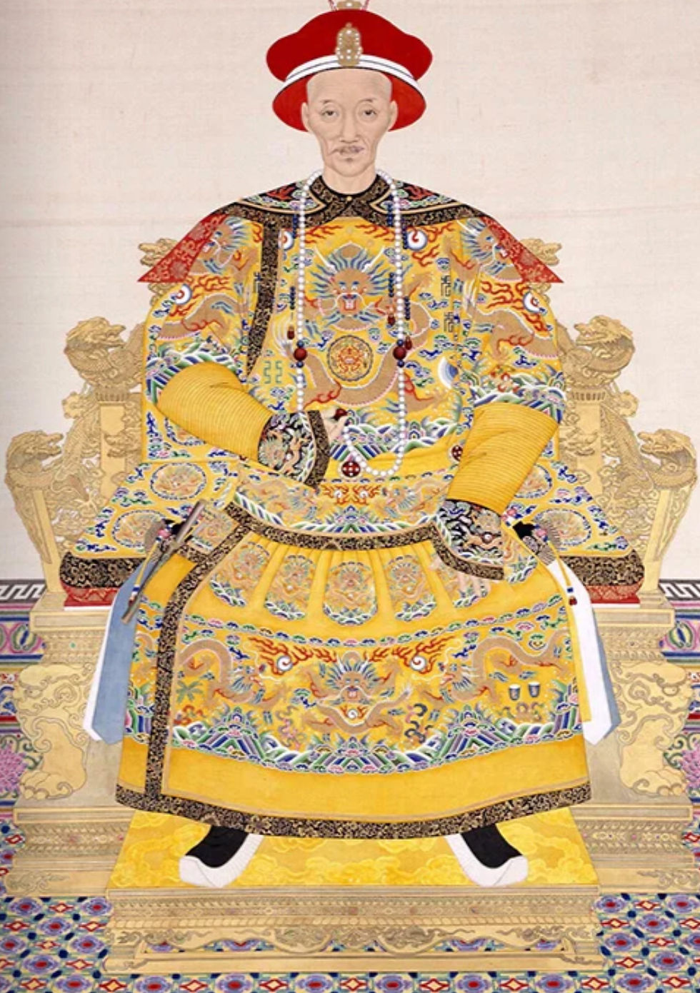
At roughly the same time that yellow was acquiring these negative associations in Europe, it could signify something completely different elsewhere. In China, bright yellow had been associated with the ruling elite for more than two millennia. Within Five Elements theory, yellow was linked with the centre and earth and became an emblem of the emperor.
During the Qing dynasty, yellow clothing and accessories were restricted to the imperial household, with particular garments reserved for the emperor (University of Cambridge Museums 2022).
Few colours seem to have occupied such opposing positions. Yellow could identify someone deliberately excluded from society, yet elsewhere it could identify the most powerful person within it. Its meaning depended not on the colour itself, but on who was using it, where it appeared and what a society had decided that yellow represented.
Yellow Becomes Fashionable
After centuries of mixed associations in Europe, yellow experienced a revival during the eighteenth century. Europe's growing fascination with Chinese art, textiles and decorative objects developed into the fashion known as chinoiserie. In China, yellow was associated with imperial authority, a striking contrast to some of the negative meanings the colour had acquired in Europe. As Chinese goods and Chinese-inspired designs became increasingly fashionable, yellow's status shifted as well (Museum at FIT 2013).

Surviving clothing shows just how desirable the colour became. The Kyoto Costume Institute holds an English robe à la française from around 1760 made from glossy yellow silk taffeta with a matching petticoat. The Institute directly connects renewed European interest in yellow with the popularity of chinoiserie (Kyoto Costume Institute n.d.). The Museum at FIT similarly holds a yellow silk dress from around 1770 and a man's yellow silk coat from around 1790, examples of a broader eighteenth-century trend (Museum at FIT 2013).

Before synthetic dyes transformed textile production in the nineteenth century, one of the most important sources of clear yellow was weld (Reseda luteola), a flowering plant used as a dye for thousands of years. Interestingly, it has not disappeared completely. Contemporary designers interested in natural and sustainable dyes have returned to weld as a source of vibrant yellow (Metropolitan Museum of Art 2024).

Yellow's return to fashion is another example of how unstable the meaning of a colour can be. A colour associated with heresy and exclusion in one period could become desirable when trade, fashion and cultural influences changed. Yellow itself hadn't changed. What people thought about it had.
Yellow in Art
By the nineteenth century, artists had access to yellows that earlier painters could only have imagined. New manufactured pigments such as chrome yellow and cadmium yellow offered brighter and more intense colour, although some came with an unexpected problem: they were not always stable.
Few artists became as closely associated with yellow as Vincent van Gogh. During his years in southern France, yellow became central to the way he represented sunlight, wheat fields and flowers. Colour carried emotional and symbolic meaning for him, and the National Gallery notes that yellow in particular referred to warmth and friendship (National Gallery 2013).
His Sunflowers paintings are the most obvious example. Rather than strengthening yellow by placing it beside its complementary colour, purple, Van Gogh pushed yellow against yellow: yellow flowers, a yellow vase, a yellow table and a yellow background. The National Gallery describes this as one of his experiments with colour and notes that he used colour to express emotion rather than simply imitate nature (National Gallery n.d.-a).
Chrome yellow made much of this possible. The pigment became available to artists in the early nineteenth century and was manufactured in a range of shades. Technical analysis of Van Gogh's Sunflowers has shown that he used several varieties of chrome yellow in the paintings. In 1888 he wrote of wanting the raw and broken chrome yellow of the sunflowers to blaze against contrasting backgrounds (National Gallery n.d.-b).

There was, however, a problem with some of these exciting new colours. Certain chrome yellows can darken towards brown or green when exposed to light, and cadmium yellow can also deteriorate. Research into nineteenth-century paintings has shown that areas originally intended to appear as brilliant yellow can look quite different today. In Claude Monet's Rouen Cathedral, West Façade, Sunlight, highlights painted with cadmium yellow have changed to brown (National Gallery of Art 2025).
That means some paintings hanging in museums today no longer contain exactly the same colours their artists intended us to see. For a colour so closely associated with light, yellow has proved surprisingly difficult to preserve.
The Science of Yellow
Unlike purple, yellow has its own place in the visible spectrum, but the way we experience it is still more complicated than simply detecting a 'yellow' wavelength. Normal human colour vision begins with three types of cone photoreceptors, sensitive to overlapping ranges of short, medium and long wavelengths. Their signals are compared through opponent systems involved in colour perception, including red-green and blue-yellow relationships (Solomon and Lennie 2007).
Yellow is also one of the four colours that people can experience as a perceptually 'pure' or unique hue, alongside red, green and blue. The precise neural mechanisms that create these unique hues remain an active area of vision research rather than a completely solved problem (Rezeanu, Neitz, and Neitz 2023).

Yellow also appears to have an unusual ability to attract attention. In an experiment comparing yellow with luminance-matched red and blue stimuli, yellow showed a measurable temporal priority: participants tended to perceive it as occurring first even when it was presented slightly later. The researchers suggested that this perceptual advantage may help explain yellow's widespread association with safety and warning (Hu, De Rosa, and Anderson 2020).
This immediately made me think of tennis. I had always accepted that tennis balls were yellow without wondering why, despite having played the sport throughout my childhood and later in life. Historically, tennis balls were black or white depending on the background of the court. In 1972, after a two-year experimental period and research showing that yellow balls were more visible to television viewers, the International Tennis Federation allowed yellow balls in the rules of tennis. Wimbledon continued using white balls until 1986 (International Tennis Federation 2019).
By then I had spent much of my childhood playing with yellow tennis balls in the Wheatbelt without knowing that their colour was a relatively recent change to the sport.
Colour Notes
A ripe yellow banana can glow blue. As bananas ripen, their green chlorophyll breaks down and fluorescent compounds accumulate in the peel. Under ultraviolet light, these can produce a surprising blue luminescence (Müller and Kräutler 2011).
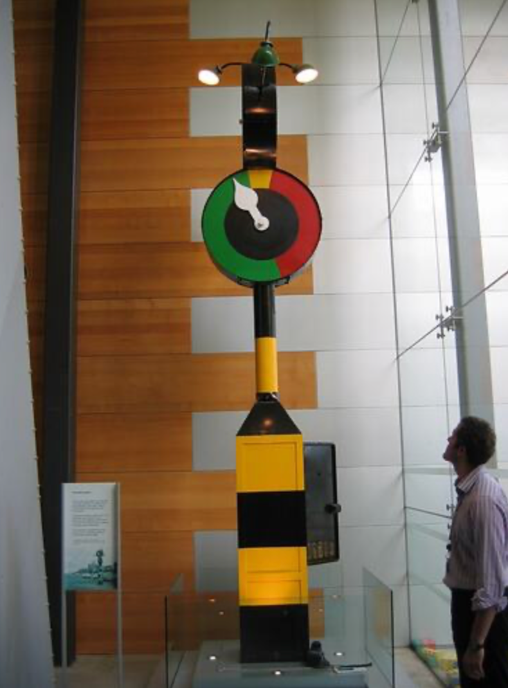
Melbourne once had clock-shaped traffic lights. Marshalite signals used a rotating hand moving around a dial divided into green, yellow and red sections. The first experimental version appeared in Fitzroy in 1937, and some remained on Melbourne roads until the 1970s (Transport Victoria n.d.).
Post-it Notes became yellow almost by accident. The team developing them used scrap paper from a neighbouring laboratory, which happened to be yellow. The colour stayed and eventually became the familiar Canary Yellow associated with Post-it Notes around the world (3M n.d.).
The familiar yellow smiley face was created in minutes. Harvey Ball designed it in 1963 for an American insurance company trying to improve employee morale and was paid just $45 for the design.
Yellow once warned that a ship might carry disease. Yellow flags have a long association with quarantine. Today, however, the international maritime Q flag reverses that expectation: a plain yellow flag indicates that a vessel is healthy and is requesting clearance to enter port.
Pac-Man has been yellow since 1980. His simple yellow form became one of the most recognisable characters of the arcade era and, for me, remains connected with my childhood introduction to video games
Tonka began in Minnesota in 1947, originally making pressed-steel toys after its founders had intended to manufacture garden equipment. The famous bright yellow Mighty Dump Truck arrived in the mid-1960s and became Tonka's best-selling toy. The yellow-and-black combination became so strongly associated with the company that Tonka now describes it as its iconic colour scheme. By 2007, Hasbro reported that Tonka was using more than 54 tonnes of yellow paint every year on its trucks and vehicles.
Conclusion
Before researching yellow, I thought of it as a colour that had appeared around the edges of my life rather than one I had actively chosen.
What I hadn't appreciated was just how complicated yellow is. Its meanings have shifted between cultures and across centuries, from power and prestige to betrayal, exclusion and warning. Its pigments have come from the earth, plants, minerals and some particularly unlikely sources, while advances in chemistry gave artists entirely new yellows to work with.
Perhaps what interests me most is how often yellow appears in things we barely notice. It is used to attract attention, signal caution, identify familiar objects and brighten ordinary ones. I may still not choose to wear yellow or surround myself with it, but after looking more closely at its history, fashion, art and science, it no longer feels like a colour in the background.
Sources and Further Reading
3M. n.d. “History of Post-it Notes.” Post-it Brand. Accessed September 7, 2026. https://www.post-it.com/3M/en_US/post-it/contact-us/about-us/.
Bandai Namco Entertainment. n.d. “History.” PAC-MAN Official Site. Accessed September 7, 2026. https://pacman.com/en/history/.
Hasbro. 2007. “Hasbro's TONKA Brand Celebrates 60 Years of Boyhood.” February 8, 2007. https://newsroom.hasbro.com/news-releases/news-release-details/hasbros-tonka-brand-celebrates-60-years-boyhood?utm_source=chatgpt.com
Hu, Kesong, Eve De Rosa, and Adam K. Anderson. 2020. “Yellow Is for Safety: Perceptual and Affective Perspectives.” Psychological Research 84 (7): 1912–1919. https://doi.org/10.1007/s00426-019-01186-2.
International Tennis Federation. 2019. History of Tennis Balls. November 2019. https://www.itftennis.com/media/2280/balls-history-of-tennis-balls.pdf.
Kyoto Costume Institute. n.d. “Dress (robe à la française), c. 1760, England.” KCI Digital Archives. Accessed September 7, 2026. https://www.kci.or.jp/en/archives/digital_archives/1760s_1770s/KCI_016.
Metropolitan Museum of Art. 2013. “Vegetable Gold.” The Medieval Garden Enclosed, February 8, 2013. https://blog.metmuseum.org/cloistersgardens/2013/02/08/vegetable-gold/.
Metropolitan Museum of Art. 2024. “Reseda Luteola.” Sleeping Beauties: Reawakening Fashion, exhibition visiting guide. https://www.metmuseum.org/exhibitions/sleeping-beauties-reawakening-fashion/visiting-guide.
Müller, Thomas, and Bernhard Kräutler. 2011. “Chlorophyll Breakdown as Seen in Bananas: Sign of Aging and Ripening—A Mini-Review.” Gerontology 57 (6): 521–527. https://doi.org/10.1159/000321877.
Museum at FIT. 2013. Trend-ology. Fashion Institute of Technology. https://exhibitions.fitnyc.edu/trend-ology/.
National Gallery, London. 2013. “The Sunflowers.” Press release, October 2013. https://www.nationalgallery.org.uk/about-us/press-and-media/press-releases-archive/the-sunflowers.
National Gallery, London. n.d.-a. “Experiments with Colour.” Sunflowers: Symbols of Happiness. Accessed September 7, 2026. https://www.nationalgallery.org.uk/paintings/learn-about-art/paintings-in-depth/sunflowers-symbols-of-happiness?viewPage=5.
National Gallery, London. n.d.-b. “Van Gogh’s Materials.” The Sunflowers. Accessed September 7, 2026. https://www.nationalgallery.org.uk/paintings/learn-about-art/paintings-in-depth/the-sunflowers?viewPage=3.
National Gallery of Art. 2025. “Pigment Alteration and Color Change.” Facture 7. https://www.nga.gov/research/publications/facture-vol-7-change/pigment-alteration-and-color-change.
National Gallery of Victoria. 2020. “Spectrum: An Exploration of Colour.” https://www.ngv.vic.gov.au/essay/spectrum-an-exploration-of-colour/.
Pastoureau, Michel. 2019. Yellow: The History of a Color. Translated by Jody Gladding. Princeton, NJ: Princeton University Press.
Rezeanu, Dragos, Maureen Neitz, and Jay Neitz. 2023. “From Cones to Color Vision: A Neurobiological Model That Explains the Unique Hues.” Journal of the Optical Society of America A 40 (3): A1–A8. https://doi.org/10.1364/JOSAA.477227.
Solomon, Samuel G., and Peter Lennie. 2007. “The Machinery of Colour Vision.” Nature Reviews Neuroscience 8: 276–286. https://doi.org/10.1038/nrn2094.
Tamburini, Diego, Charlotte Martin de Fonjaudran, Giovanni Verri, Gianluca Accorsi, Angela Acocella, Francesco Zerbetto, Amarilli Rava, Samuel Whittaker, David Saunders, and Sharon Cather. 2018. “New Insights into the Composition of Indian Yellow and Its Use in a Rajasthani Wall Painting.” Microchemical Journal 137: 238–249. https://doi.org/10.1016/j.microc.2017.10.022.
Transport Victoria. n.d. “About Traffic Signals.” Department of Transport and Planning, Victoria. Accessed September 10, 2026. https://transport.vic.gov.au/road-and-active-transport/business-and-industry/road-and-traffic-management/traffic-lights/how-traffic-lights-work/about-traffic-signals.
University of Cambridge Museums. 2022. “Colour: Art, Science & Power.” https://www.museums.cam.ac.uk/story/colour-art-science-and-power/.


Comments